SUMMARY
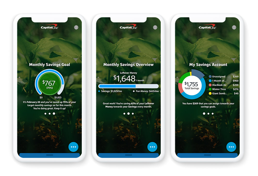
Digital Guidance & Advice (or DGA) was a native iOS and Android app that provided Capital One customers with proactive, personalized, and holistic financial advice, based on their life goals. It incorporated a conversational chat interface (CUI) and dynamic, personalized page elements, data visualizations, and flexible design components for DGA entry points throughout the Capital One app experience.
FOCUS
Design a user experience that makes it easy for the user to track and monitor their personal financial goals while elevating best practice financial advice at the appropriate time.
DGA R5.x Custom Plan Monitoring & Tracking UX, Visual, & Motion Design
Guiding Questions
How do users want to track their progress saving towards a goal? What determines whether a user is on-track or off-track to reach their goal, and how do we visualize that to the user? Is the user tracking to the target date of completion for their goal or the target goal amount? What key data points are most important to the user when monitoring their progress? How does the value of that information change over the course of their journey?
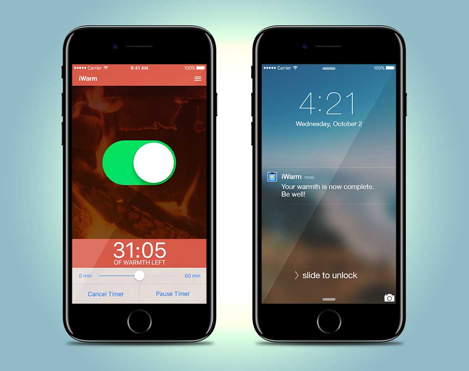
DGA R1 Plan Tracking Card Motion Design
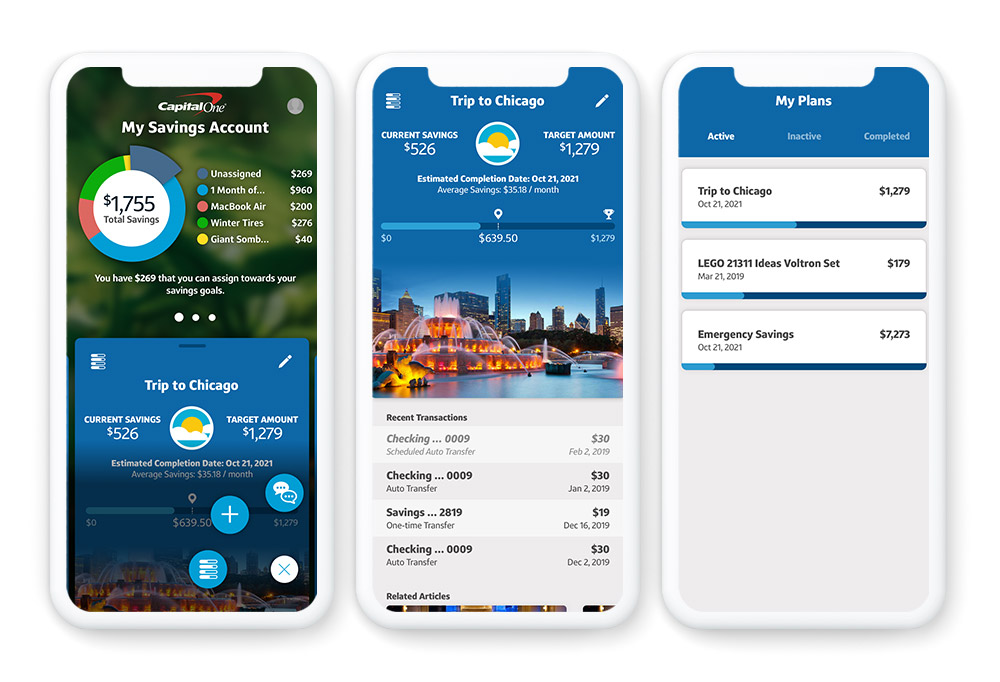
DGA R2.5+ Plan Tracking Card UX, Visual, & Motion Design
Innovation Approach
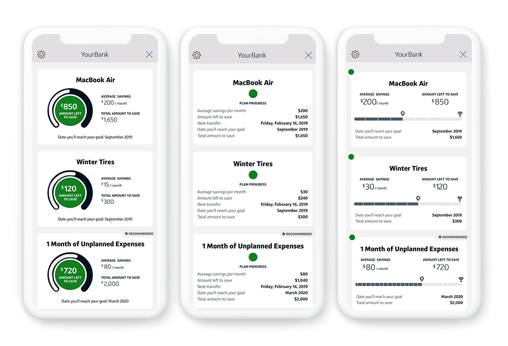
Working with the research and content strategy teams, I developed a series of low-fidelity plan tracking “card” wireframes. These wireframes represented different data visualizations and data points across long-term and short-term goals, as well as different points in the user’s progress toward those goals (at the beginning of a plan, midway through a plan, about to complete a plan). We then created a series of Jobs to be Done statements which we user-tested against the wireframe prototype to determine the most important data points to elevate at which particular times over the course of a given savings plan.
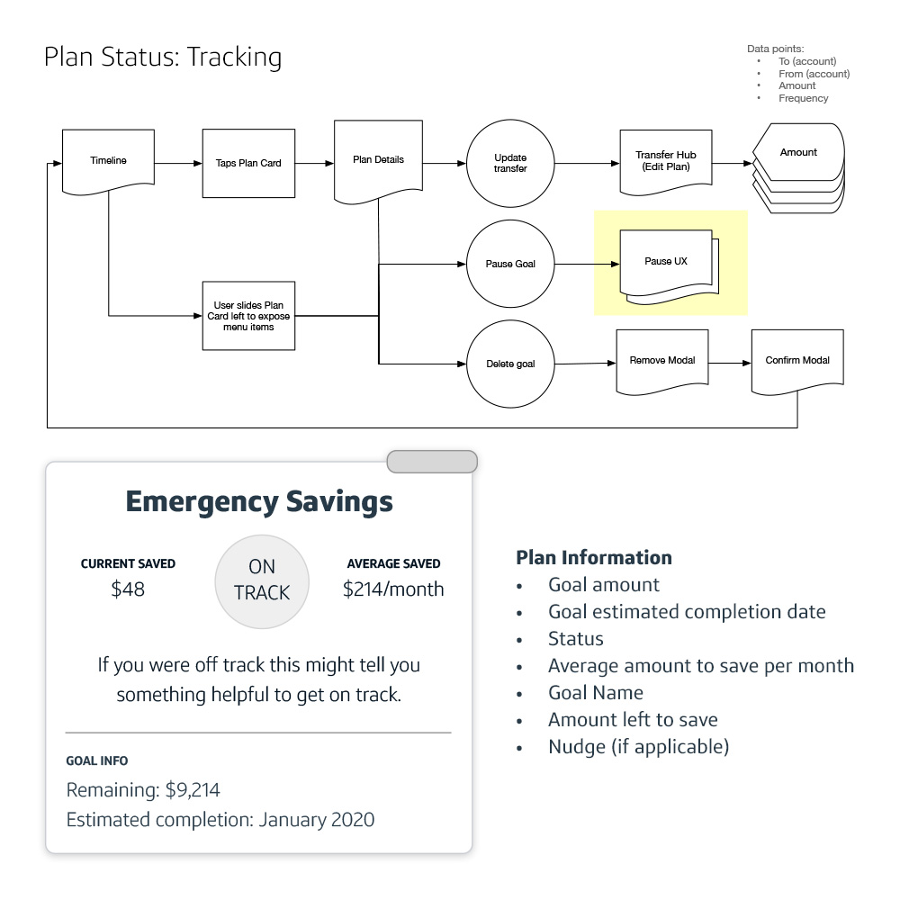
DGA R3.5 Plan Status UX, Visual, & Motion Design
Refinement & Visual Design Exploration
I applied what we learned from the user-testing to UX flows and designs, and brought the navigation, personalization, and plan tracking solutions to life through high-fidelity visual and motion explorations.
