SUMMARY
Digital Guidance & Advice (or DGA) was a native iOS and Android app that provided Capital One customers with proactive, personalized, and holistic financial advice, based on their life goals. It incorporated a conversational chat interface (CUI) and dynamic, personalized page elements, data visualizations, and flexible design components for DGA entry points throughout the Capital One app experience.
FOCUS
Design a user experience that allows the user to create and manage personal financial goals with confidence – understanding how their goals fit into and affect their holistic financial picture.
DGA R5.X Custom Goal Creation, Editing, and Grouping UX, Visual, & Motion Design
Guiding Hypotheses
Our exploration of how users might create, organize, and edit personal financial plans within DGA started with this hypothesis: Users desire a holistic view of their finances, and want to know how their personal goals fit into their larger financial picture. In addition, we hypothesized that their financial goals and plans should not be tied to a specific account. Rather, the plans should function as an “account agnostic” experience.
Innovation Approach
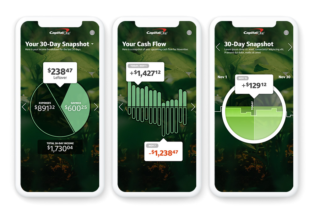
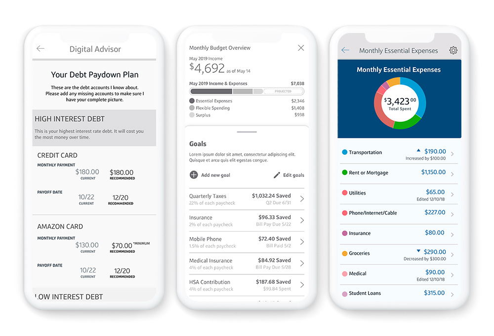
Visualizing a financial overview for the user was key for them to understand how their personal plans fit in with their overall income, cashflow, and budget as well as their financial best practice plans. Working with our research team, we explored as many different data visualizations, layouts, and interaction models as possible to produce the most effective experience for our users.

DGA 4.x Financial Overview Explorations UX & Visual Design

Early Financial Overview Explorations UX & Visual Design
Refinement: Interface Design and User Flows
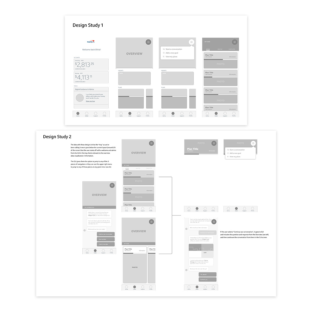
Determining how the user might organize, modify, and personalize their plans was the next stage. Our questions included: What are the entry points? What are the most important elements to surface and when? How does the user adjust an individual plan and understand how it affects their overall financial picture as well as their other plans?

DGA R3.X Suspending / Continuing a Plan UX, Visual, & Motion Design
DGA Overview & Plan Navigation Exploration UX, Visual, & Motion Design
Solution: The “Jogger”
As I explored the idea that a user’s savings goals were similar to a stock allocation in a portfolio, I developed the concept of a “jogger” interface. This allowed the user to see an all-up view of their goals and to see how increasing or decreasing their goal contributions affected their other goals and their financial picture as a whole. The ability to group goals was a unique opportunity for users to better organize and personalize their goals.


