SUMMARY
Digital Guidance & Advice (or DGA) was a native iOS and Android app that provided Capital One customers with proactive, personalized, and holistic financial advice, based on their life goals. It incorporated a conversational chat interface (CUI) and dynamic, personalized page elements, data visualizations, and flexible design components for DGA entry points throughout the Capital One app experience.
FOCUS
Create visual and motion guidelines for the chat interface (CUI) that reinforced the user experience of chatting with a trusted advisor. Create detailed documentation for and work directly with iOS and Android engineering teams to ensure animations are pixel-perfect.
DGA R5.X Natural Language Chat Interface UX, Visual, & Motion Design
Creating a Trusted Digital Advisor
The integration of a chat user interface (CUI) was a key feature of the Digital Guidance & Advice product from day one. The digital advisor could be proactive and notify the user when there was an upcoming event or milestone. It could be reactive and answer the user’s questions or help guide them towards good financial practices. The challenge was making the digital advisor a trusted and natural experience for the user through visual and motion design.
Starting Point: Simple, Low-Fidelity Interactions
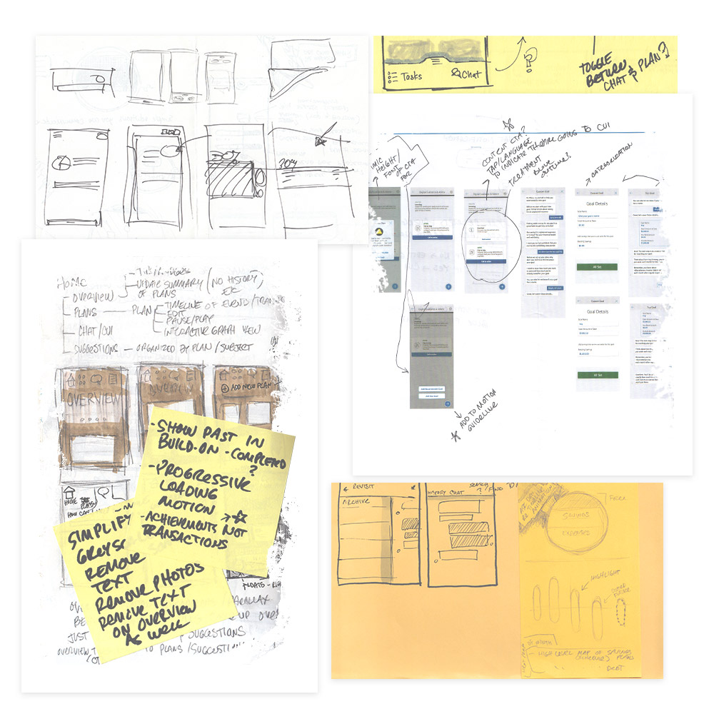
Working with the content strategy and UX teams, I created a list of interactions that represented the minimal viable CUI product. I created wireframes and motion studies of the simple interactions in greyscale to focus attention on the UX and motion for testing, review, and feedback.

Greyscale CUI User Selecting Response & Scrolling Exploration UX, Visual, & Motion Design
Greyscale CUI Scrolling and User Changing Response UX, Visual, & Motion Design
Refinement: Visual Design & Data Visualization
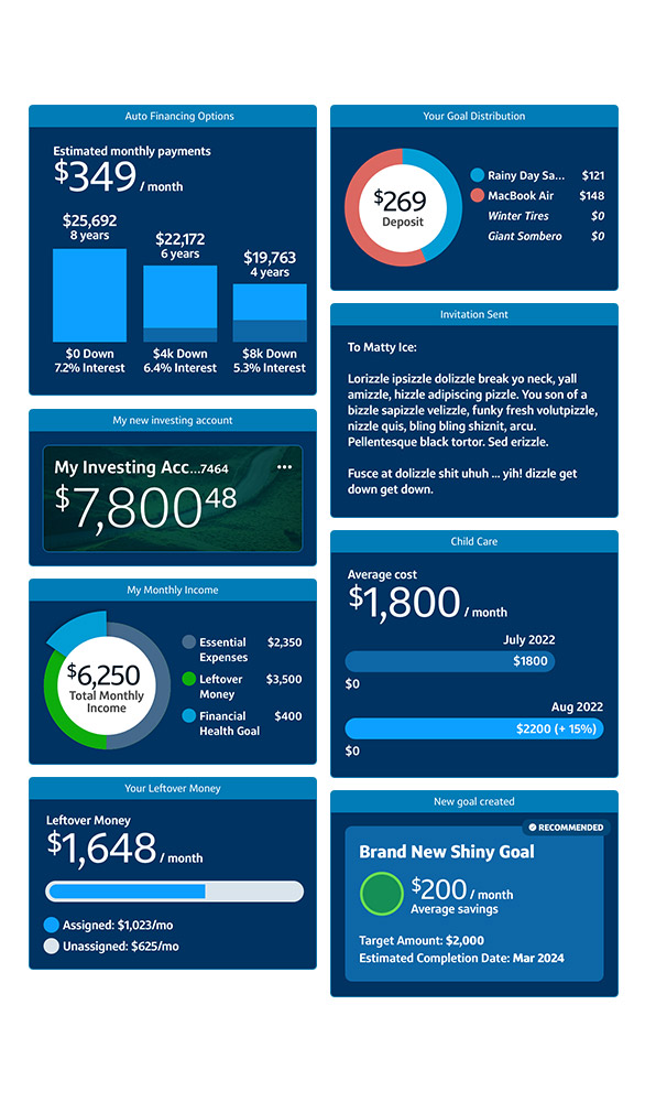
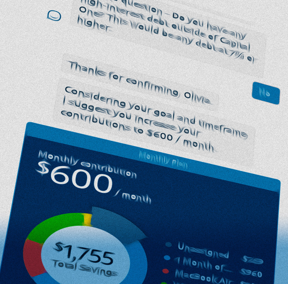
After receiving and incorporating feedback, I created low-fidelity motion studies as a foundation for engineering, and created visual design and data visualization templates for the UX team to build out high-fidelity UX flows for testing and integration. I then created detailed motion guidelines for all CUI interactions that the engineering teams used to update the UI.


