In the latter part of 2022, I became the Feature Lead / UX Design Lead of the World Systems UI / UX Team – a fantastic team of 10-12 experts representing Production, Test / QA, UX Design, Engineering, UI / UX Technical Design, and Visual Design. As the Feature Lead, I led the design, implementation, and shipping of features such as: The Pathfinder Objective System, Search Areas, Power & Difficulty Communication, and Featured Quests across multiple title releases –including Lightfall, Into the Light, and The Final Shape.
In addition to many high-profile features, the World Systems UI / UX Team was also responsible for all the UI support needs for the Raids and Dungeons, The Director (Destinations, Destination Maps, Quests), Campaign and Seasonal Activities, and Ritual Activities (Gambit, Crucible, and Vanguard Ops).
Management and mentorship of 6 direct reports; Engaged in staffing panels and performance reviews of dozens of candidates across multiple disciplines; Mentorship of Project Managers, UX Designers, and UI Artists.
Feature Highlight: Pathfinder
High-Level Goals & Constraints
Design and implement an exciting, unique objective system in Destiny 2 for the first time in years that would replace the core Bounty system for The Final Shape title release.
The new system would need to support objectives that could be completed and rewards that could be claimed daily or weekly with a weekly system reset cadence – all based on existing investment tech.
Design Priorities
The previous Bounties system required players to acquire the objectives from NPCs at various locations in the game which took time away from gameplay and provided limited options for objectives and rewards.
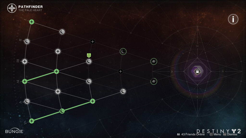
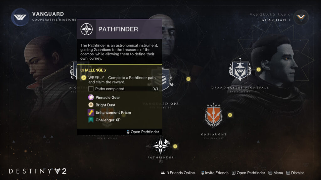
My goal was that the UI / UX Design and player journey of Pathfinder started with a system where objectives were automatically granted to players without the need for them to acquire the objectives from an NPC – allowing the player to both make and view their progress on the objectives in the system passively. They would have agency over which objectives to focus on in order to complete the system for a reward as well as be able to reset the system should they want to seek greater rewards.
Many systems in Destiny 2 were complex and required a good deal of on-boarding and explanation, via tooltips and dialogs, for players to understand how to engage with the systems.
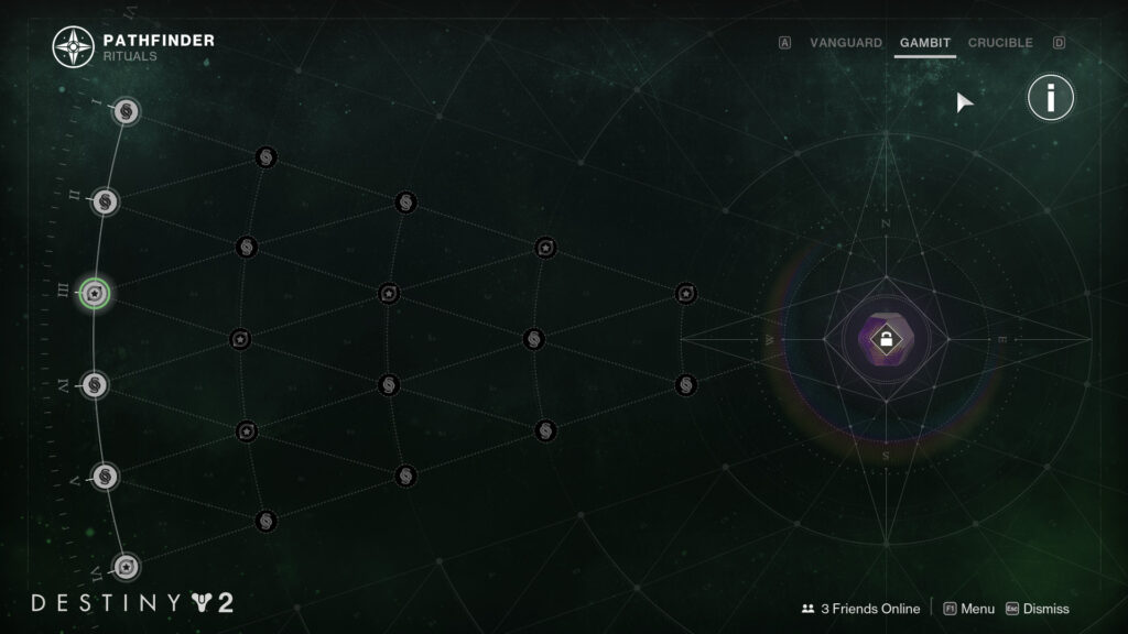
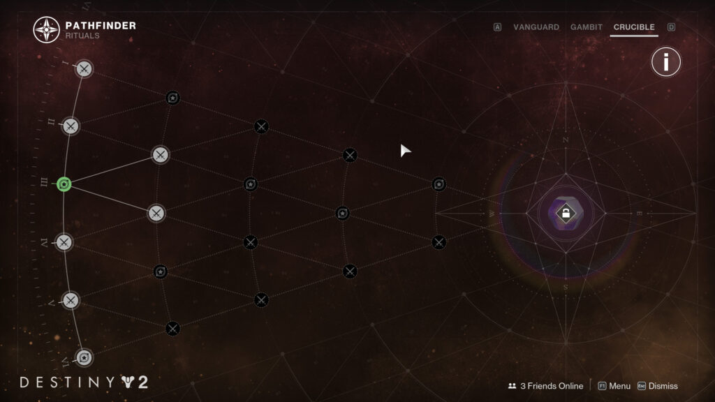
My goal was that the UI / UX design of Pathfinder be easily understood by the players visually – via its layout, iconography, and element states – without the need for verbose explanation
Many objective systems in Destiny 2 both look and function very similar (EX: Guardian Ranks, Triumphs, and Seals). In addition, the objective completion notifications (“toasts”) in earlier systems were often intrusive to the player’s gameplay.
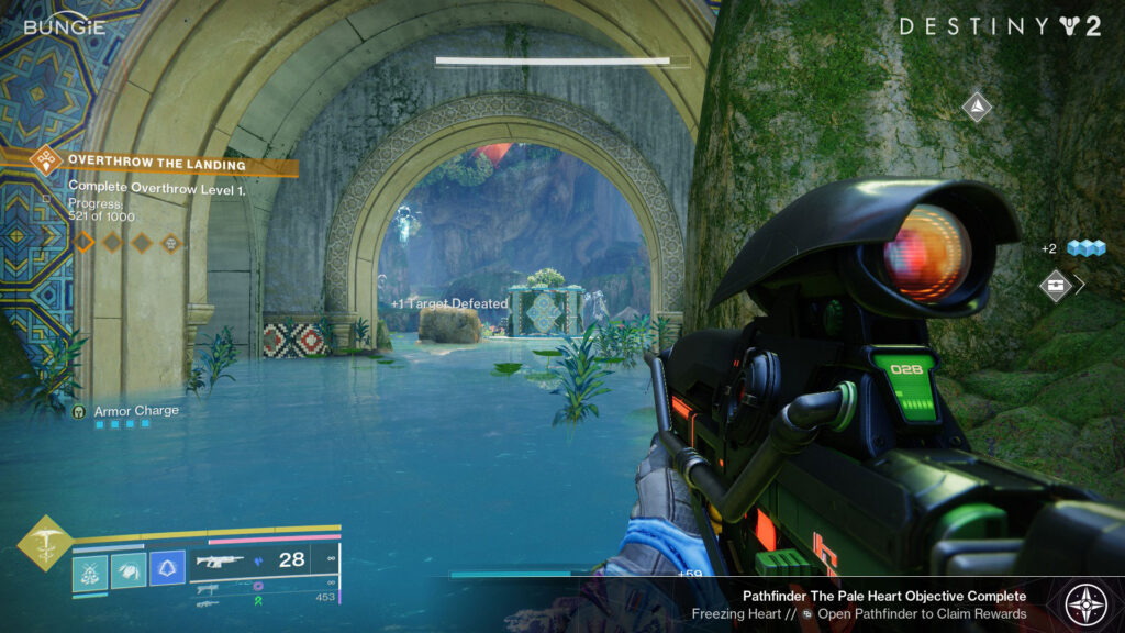
My goal was that the UI / UX design of Pathfinder look and feel different and new for the player while still maintaining the aesthetic and fantasy of the Destiny design system. A related goal was to design a unique, less intrusive notification system that wouldn’t interrupt the player’s gameplay or cover up important HUD elements.
Summary
Worked with Design Leadership, Investment Design, UX Design, and Visual Design to design and implement a completely new objective system for Destiny intended to replace bounties and patrols in the new destination released for The Final Shape: The Pale Heart
Designed a new less obtrusive toast to support objective completion in Pathfinder without interrupting the player’s gameplay or obscuring their HUD so that Pathfinder could be applied to the Rituals playlist as well
Designed and implemented an updated single access point Pathfinder UI screen that allowed the player to access three individual Pathfinder sequences – one for each Ritual (Gambit, Crucible, and Vanguard Ops) – from a single screen to improve usability of the system in Ritual playlists
Results
The Pathfinder system was so well-received in usability testing that we were able to convince Leadership to replace the bounty system across all the ritual activities in Destiny 2 (Vanguard Ops, Gambit, and Crucible) with the new Pathfinder system.
Destiny 2: The Final Shape | Pathfinder
Complete video of player engaging in Pathfinder, completing a Pathfinder path, claiming their reward, and then resetting the Pathfinder objectives.
Feature Highlight: Activity Power & Difficulty Communication
High-Level Goals & Constraints
Player power in Destiny 2 is complicated. Really complicated. In some cases, power mattered to the player’s success in a specific activity (i.e. The higher the power, the more successful a player may be) and, in other cases, power was “fixed” – meaning that all players were normalized to a single power level while in that specific activity (i.e. It didn’t matter how high or low the player’s power was going into the activity, they would have the same chance at success). Some activities put a cap on player power (meaning going beyond that power level didn’t matter) and some activities always ensured that combatants were at a power delta higher than the player to increase combatant difficulty. Not to mention that combatants weren’t the only element that could affect “difficulty” of an activity – there were other elements such as complicated mechanics, jumping puzzles, and number of players in the activity that could affect difficulty.
One thing was clear though: The significance of player power level and how it related to activity difficulty in Destiny 2 was never communicated clearly or accurately to the players – leading to confusion and, ultimately, many players doing their own testing and creating their own narrative about how power related to activity and combatant difficulty across the game.
I, along with my team, was tasked with auditing the existing activity UI and working with Frameworks, Activity Design, Leadership, Engineering, Investment, and other UI/UX areas to align on, design, and implement a holistic, easy-to-understand, consistent system of communicating both how player power level relates to combatants and the difficulty of every activity across the game.
Design Priorities
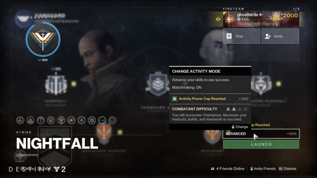
The previous system only communicated a largely arbitrary number titled “Recommended Power” to players without accurately explaining how or if the player’s current power level actually affected the difficulty of the activity the player was about to launch into.
My initial task was do a holistic audit of all activity UI entry points to determine the scope of the UI we would need to update across the game and then align with partner teams, such as Frameworks and Activity Design, to better understand the impact of power and difficulty in activities system-wide. Through this collaborative process, we were able to optimize the tiers of activity difficulty, determine how best to clearly communicate the tiers to players and where in UI, and identify situations where power was important to the player and situations where power was less important to the player.
Not only was there no communication to players about which activities were affected by player power and which were not, but the system itself, as I learned, was extremely complicated. Identifying the areas where we would communicate this information was the first step, how we communicated the information was another.
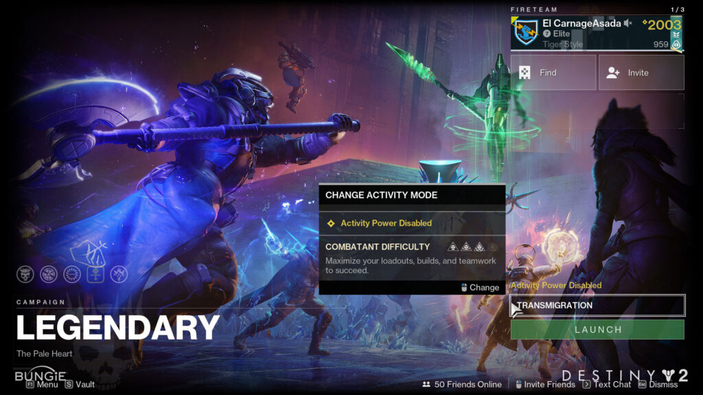
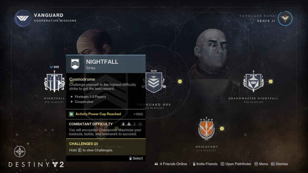
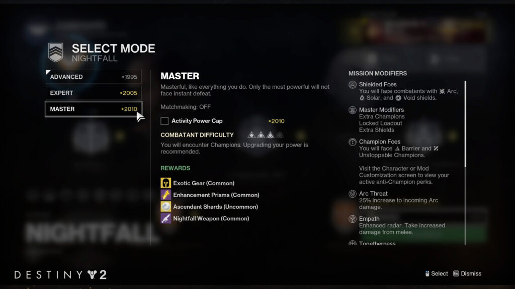
My goal was that the UI / UX design of this updated system be reduced down to the bare minimum of what the player needed to ensure that they were making an informed decision before they launched into any activity in the game. I had determined that there were, effectively, three primary pieces of information the player needed to make an informed decision:
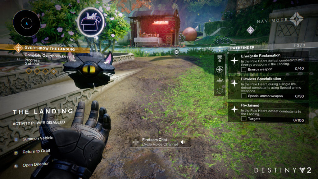
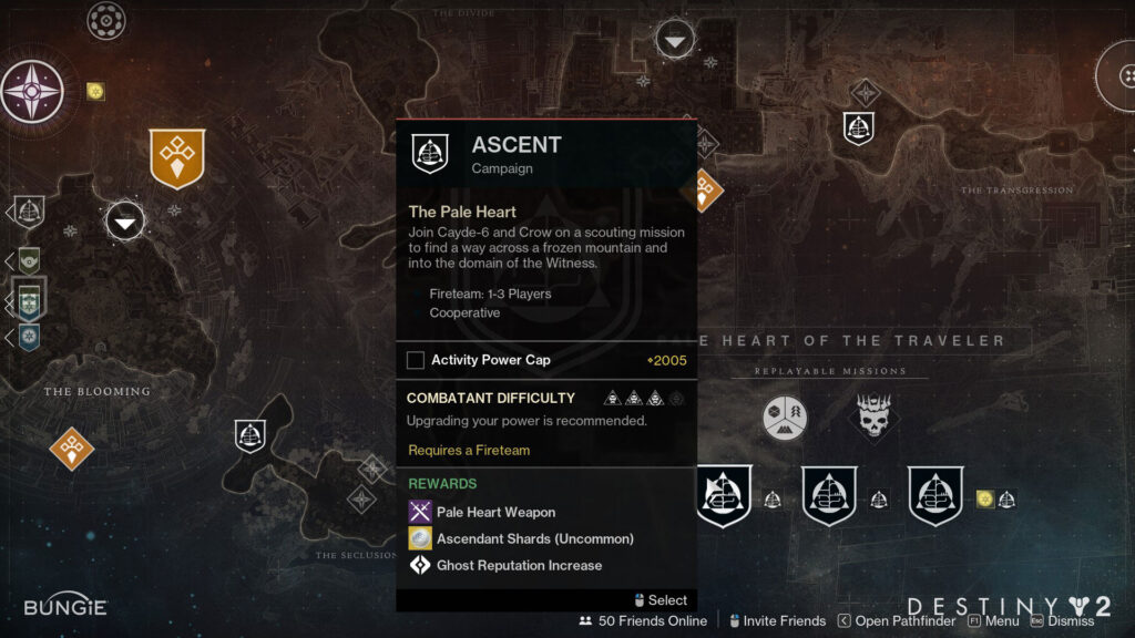
Player / Fireteam Power: Whether power was enabled or disabled (“Fixed”) on an activity and, if it was enabled, what the player’s or their fireteam’s power was in relation to the power of the combatants in the activity. If there was a “power cap” applied to the activity, whether or not the player’s or their fireteam’s power had reached that cap yet or not
Combatant Difficulty: Some activities could have bosses or champions or other combatants that, regardless of power, were more difficult to fight than others. Informing the player that they could encounter these combatants would allow them to prepare for such encounters before they launched the activity
Recommended Action: Based on the various combinations of power options, activity difficulty, and combatant difficulty, I worked to create a logic tree that could recommend specific actions the player should consider, based on their current level, to improve their chances of success in the activity. We were able to reduce this information down to a few dynamically generated simple sentences to better prepare the player of what to expect before they launched into an activity
Summary
Worked with Design Leadership, UX Design, and across multiple teams to align on a clear and easy-to-understand method of communicating the player’s power and how it relates to the power of the enemies in a given activity, as well as the difficulty the player could experience in a given activity system-wide across the game
Worked with User Research and UX Design to run our designs through multiple user research studies to ensure our designs were effective considering this would be a significant change in how we communicated this information to the players
Designed the logic and flow of how and where information would be displayed so it could be implemented in a consistent way across multiple areas in our UI
Results
Players and their fireteams were, for the first time, clearly informed about what to expect from an activity in terms of combatant difficulty, how power may or may not impact their success in the activity, and how to best prepare for the activity before they clicked the launch button. It was a game changer, especially for players who were new to Destiny, to have this information exposed to them in a clear and meaningful way and was well received across the community.
Featured Quests
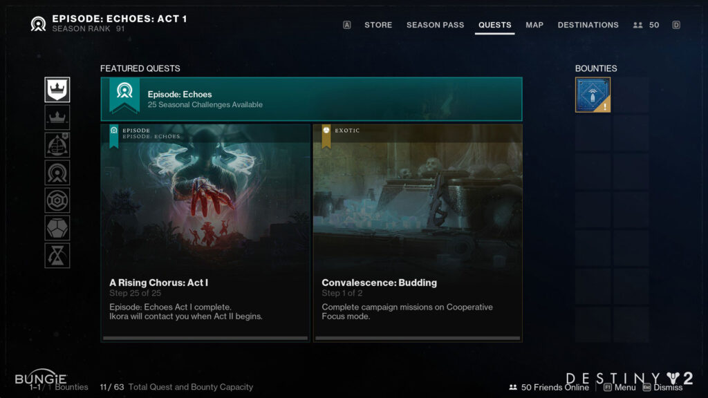
Worked with Design Leadership, UX Design, and Visual Design to design and implement a new home tab for the Quests log that clearly highlighted the most important quests for the player to focus on at a glance
Gave the player agency over the screen by allowing them control over the default tab viewed when accessing the screen (via Tab Favoriting) as well as prioritization of Quests in the stack (via Quest Tracking)
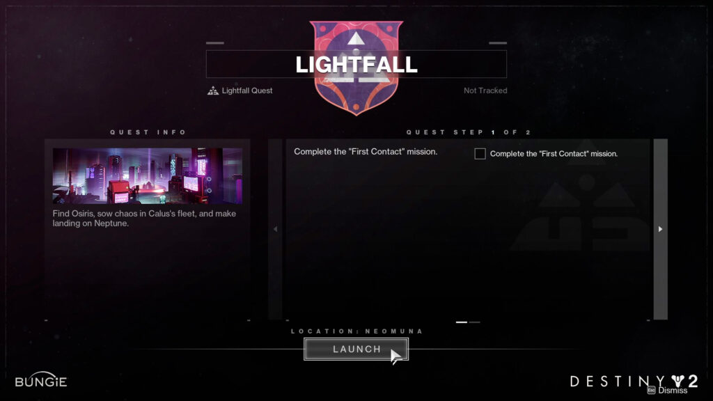
Pushed to allow Direct Launch of Quests to the player for the first time in Destiny – allowing players to launch into the appropriate Activity or Landing Zone on a Destination directly from the Quest Details screen (vs. needing to navigate through the Destinations Map and find the correct Activity or Destination)
Into the Light
Worked with Design Leadership, UX Design, and Visual Design to design and implement the Into the Light UI screen and activity support for the player. Our team was responsible for the following:
- Into the Light node in the Director
- Into the Light Screen branding including nodes for Pantheon, Onslaught, and the Hall of Champions
- Onslaught: Activity Support UI (Branding / Style Guide, In-activity Objective UI, etc.)
Additional Final Shape Feature Work
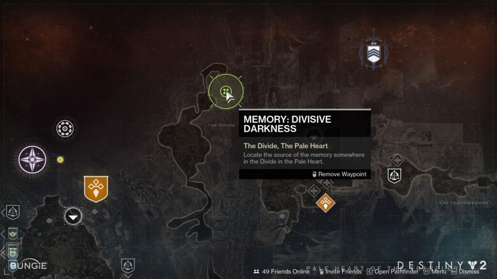
Search Areas: A new system that allowed for our activity designers to highlight an area on our map for the player to search for an object vs. having a waypoint that pointed directly to the location of the object
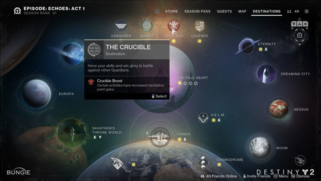
Communicating Active Ritual Rank Bonuses: Allowing the player to understand when our Ritual Activities had active rotating boosts available – information that, previously, was only available through third-party websites or tools – by exposing the information in the tooltips when the player hovered over the Ritual activities in the Director
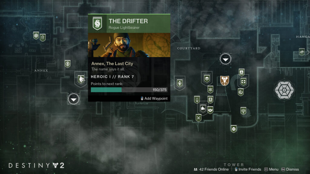
Improving Communication of Vendor Rank: Re-worked our tooltip information architecture to more clearly inform our players of their progress as they increased their rank across our vendors. Exposed rank information to the player when they hovered over the vendors in the Director – information that, previously, was only available if the player traveled down to the Destination and interacted with the vendors.
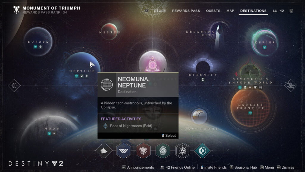
Communicating Active Featured Raids and Dungeons: Allowing the player to understand when a specific Raid or Dungeon was the Featured Raid or Dungeon that week and where to go to launch the activity – information that, previously, was only available through third party websites or tools – by exposing the information in the Destinations breadcrumb tray as well as in tooltips when the player hovered over the Destinations.